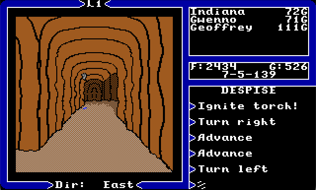
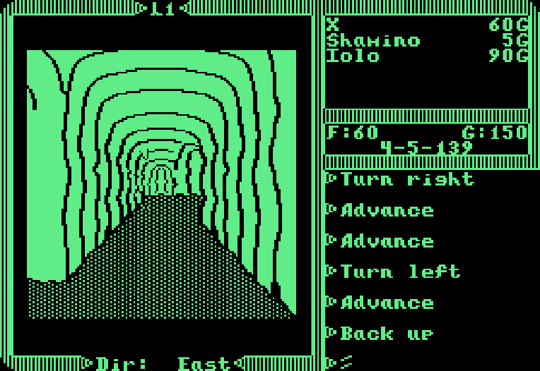
The Graphics engine looks like it’s a GO. So I have been working through various iterations of the Dungeon, Mine and Cave graphics.
The new Graphics engine, the third iteration I have worked on, is now working very, very well. It is blisteringly fast, uses minimal resources, and has reduced the code base slightly.
I took the approach of building all the dungeon ‘views’ as arrays, which are then assembled in code, depending on the player’s viewpoint, and a final version is sent out to a graphics call which builds the scene in one pass. Very efficient and very fast. Arrays take up some space, but maybe manageable.
I have decided not to go with a straight copy of ‘Warriors of Destiny’ dungeons, even though I was sorely tempted, and instead have opted to build my own versions, attempting to bridge the gap between the original Apple II versions, and Dos versions, all while adhering to the restrictions of the psuedo ‘Apple II’ graphical aesthetic I have limited myself to.
The ‘Dungeon’ and ‘Mine’ type dungeons worked very well, and have a decent look I feel, somewhere right between their two inspirations.
The ‘Cave’ type dungeon has given me much more trouble. Mainly that was because both the Apple II and DOS versions were not very inspiring compared to the dungeona and mine types.
 This plus
 This, equals blah.
I started over and built a dungeon type which was close to the above two, but with a ‘rounded’ floor. However, upon completion it appeared much too…intestine like. Too smooth, not cavey enough.
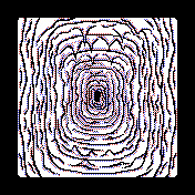 Cave or...intestines?
So I started over again, and again, and again, and finally started to evolve a look:
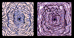 Caves...
 More Caves!
That look is starting to get settled now, and is nearly ‘set’. However, still some fine-tuning to do, especially when making it fit into the 220 tile limit the new graphics engine demands.
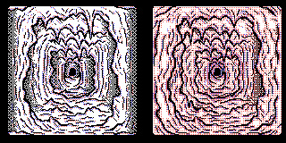
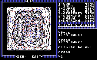 Cave 2.0
It certainly looks a little more cavey. However, there is a ‘legibility’ issue I think. The old caves looked less like caves, but were very easy to understand and navigate. My version suffers here, and sacrifices visual fidelity for …realism? Something like that.
Nevertheless, caves are not meant to be clear and easy to navigate, are they? They are dark, confusing and irregular, I should think. Perhaps my version is closer to this?
I am going to keep tweaking cave versions until I get one that makes me happy/happier.
Feed
Share