Take a look at this screenshot:
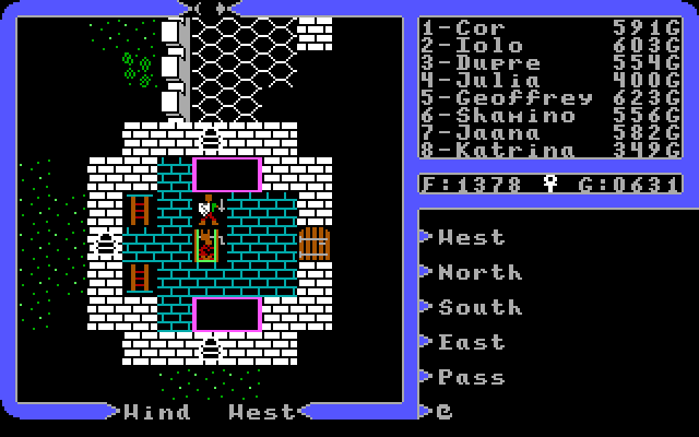 How many differences can you spot between it and vanilla Ultima IV for dos?
10 points if you can spot 10!
OKay, some are old, or have been shown in previous screenshots. Howver, several are new, and represent some work done recently.
- One is the avatar. Look at it carefully. Dos colors, with true Apple II form.
- Another is the frame. Dos colors, but the shape is the Apple II version.
- Fonts are changed as well. Dos colors, but fonts straight from Apple II version.
- The Ankh is bright white, rather than dull white.
- The 'dungeon' floor tile, outside the window, is properly balanced and not wonky like in the dos version. Closer to Apple II version once again.
- Perhaps last, but not least...the ray casting! Dos version's ray casting was nearly non existent. Now we have something much closer to the Apple II original.
Tweaking/Improving the raycasting was no small chore. And it is not done yet. I think it represents one of the major differences between the dos port and the original Apple II version. I didn’t really realize how big a change it was until I started tweaking it. There was always something about the Apple raycasting, that lent to the danger of the adventure. Perhaps it was that the screen was always a little darker, perhaps it was that you couldn’t see what lurked around the corner. Whatever it was, I liked it, and getting it going in Trinity is on.
Here are some gifs comparing the two versions of the algorithm I have come up with, with the original dos and Apple II versions. Neither is a perfect replica of the Apple 2 algorithm, but they are much closer than dos. The funny thing was, I barely modified the dos algorithm. Only the tiniest tweak, almost like fixing a typo, was enough to make the algorithms effects align very closely with the Apple IIs. Odd.
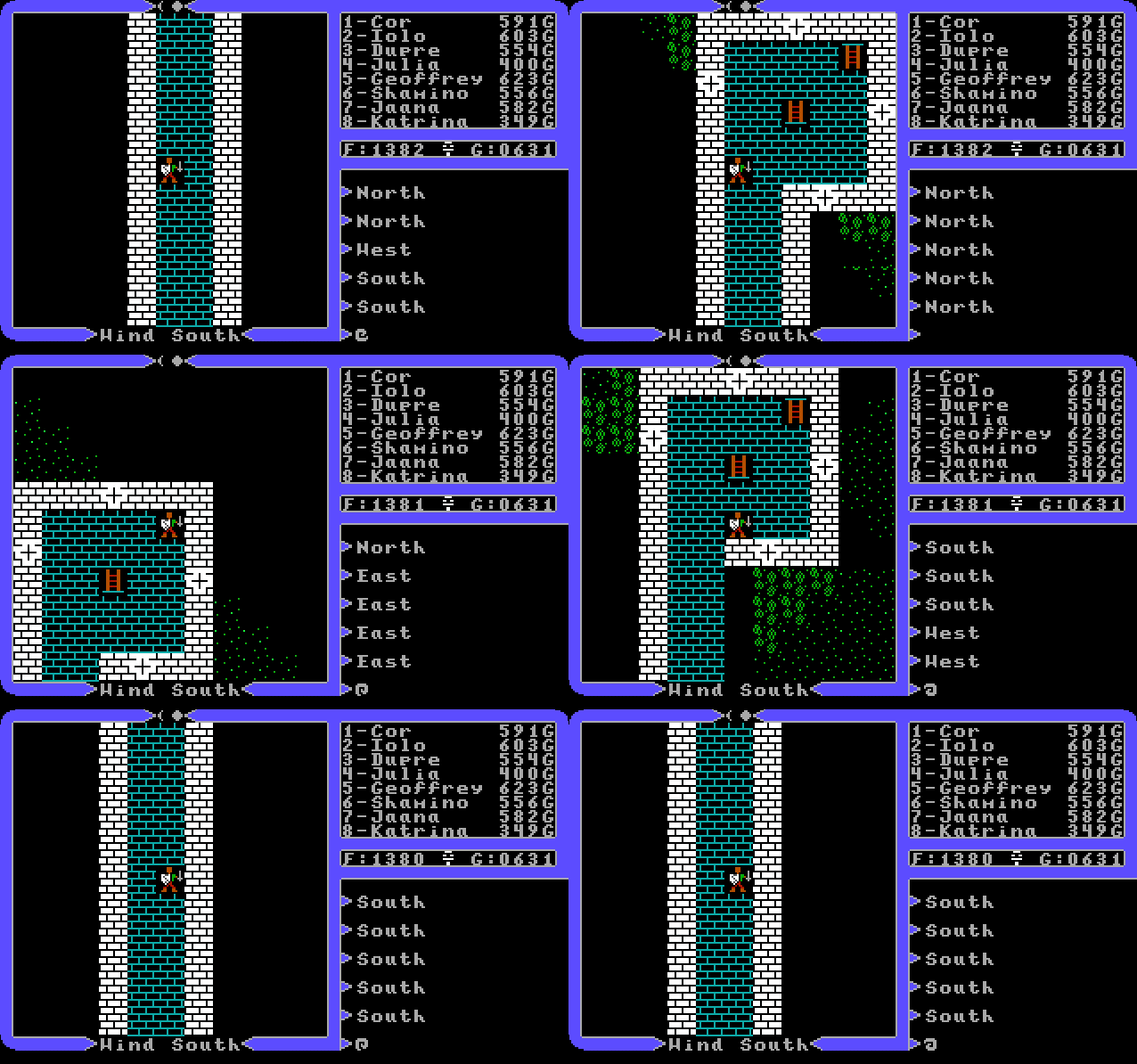 Ray Cast Version One
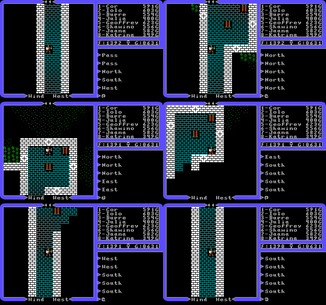 Ray Cast Version Two
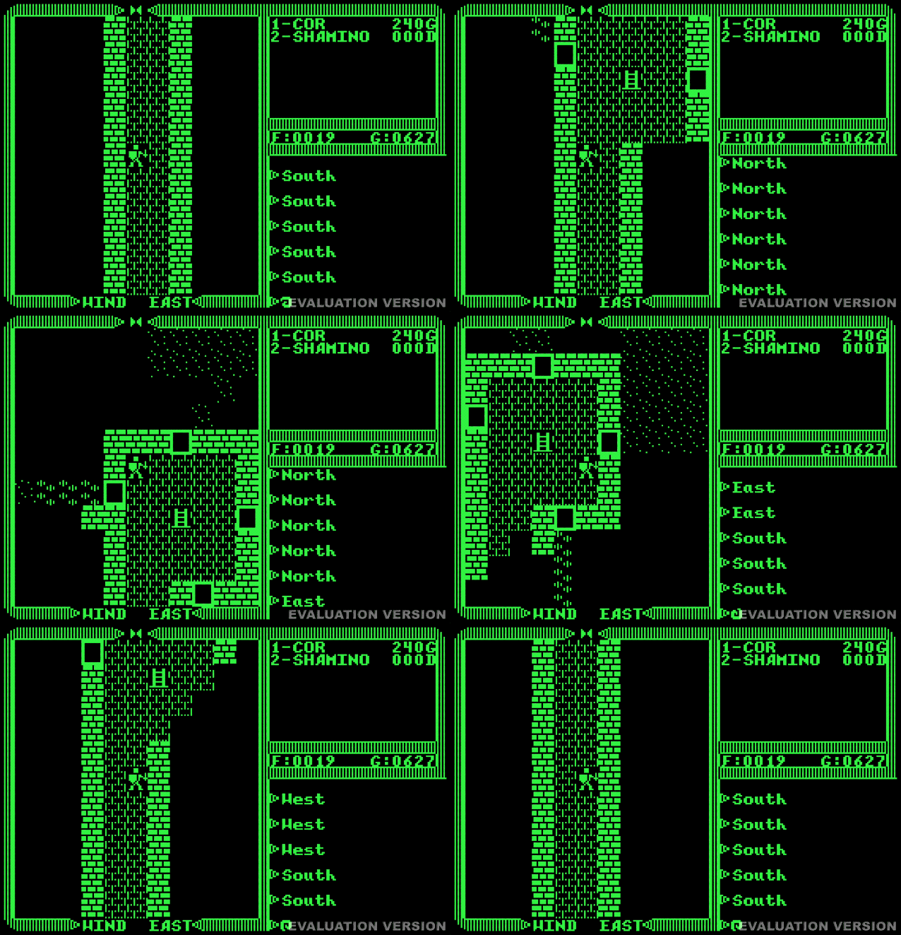 Ray Cast Apple II Version
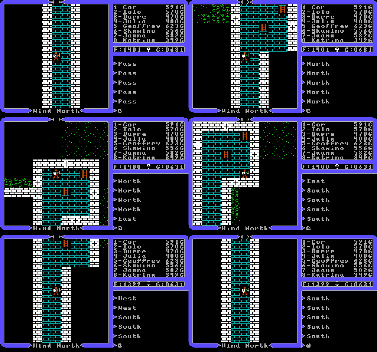 Ray Cast Original Dos Version
I definitely like both my new algorithms, but which is better…Hmmm…Kinda leaning toward version 2…
Feed
Share